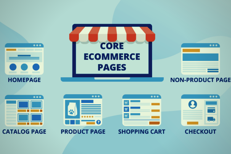
As more consumers flock to online retailers for anything from necessities to luxury purchases, eCommerce is a trend that isn’t going away anytime soon. When you put up an eCommerce site, you can sell to a much larger audience than you could in a physical store. Here are some designing tips for eCommerce website development.
What makes a good eCommerce website?
You could be losing critical clients if your online store is not optimized for sales, no matter how brilliant your online marketing is. You could also be squandering your ad expenditures if users leave your site as soon as they arrive. If you follow these tips for eCommerce websites designing, you’ll see an increase in conversions in no time!
1. Emphasize Your Branding
You’re more likely to buy something from a clean, easy-to-navigate website that provides essential information on the things they’re selling. For an eCommerce site, branding is crucial. Your visitors should comprehend what you do and get a sense of your brand’s personality as soon as they arrive on your page. Your personality must reflect in all of the pages of your website. Contact an eCommerce website development company for the best and a custom eCommerce design as per the products that you offer.
2. Precisely consider the colouring while designing
It’s a good idea to pick colors for your website that represent your brand and reflect your company’s and audience’s moods. Colors can evoke emotions and specific feelings in people who are exposed to your items or brand. Precisely choosing the colors is essential for the best eCommerce web design.
A company offering high-end spa and bath items, for example, could require a minimalist design with a lot of white space to create a crisp, clean sensation, similar to how you want to feel when you’re ready for a spa treatment. Incorporating touches of purple, a hue associated with luxury might increase its appeal to a high-end audience even further.
3. Keep It As Simple As Possible
Simplicity results in a cleaner, more user-friendly website that encourages customers to buy. In most circumstances, the less you add to your website, the better it is for your visitors. Advertisements slow or leggy pages, and hundreds of links to navigate to discover what they’re looking for won’t distract them.
Another benefit of a minimalist design is that it limits the options available to your audience. When you’re trying to get customers to buy your stuff, the fewer options you provide them, the better. Consider how you can simplify your menu selections and product pages to avoid clutter, unnecessary choices, and distractions on your website.
4. Allow space for product and lifestyle photography.
Ensure your product photographs and other imagery on your site, such as the homepage, have a consistent aesthetic. Your product photographs should also be crisp and huge, at the very least, large enough for customers to examine your goods in detail. This is among the eCommerce homepage best practices.
If you don’t know how to use a camera, it’s worth investing in professional photography for your website. When done effectively, product images can help you sell more things by supplementing your product descriptions. If possible, take shots from several perspectives and of the products in action. It’s better if your customers can view as much detail as possible.
5. Make your pages scan-friendly.
Your website, like a blog entry, should be scannable. Instead of giant walls of text, your design should rely on images and photos that direct users to other parts of your website.
Instead of using many words in your “About” section and on your homepage, use brief blurbs. Feel free to write intriguing item descriptions on product sites, but include bullet points rather than long paragraphs of content. This helps to design an eCommerce website that will attract more customers.
6. Testimonials and reviews should be included.
For online businesses, including an eCommerce website, customer testimonials and reviews are vital! While going online, the customers won’t be getting any 1-on-1 experience like the offline shopping methods. They must know the fact that you are a trusted platform to shop with. This is where social proofing and testimonials come into play.
There are various eCommerce themes available with various adjustable testimonial sections so you can consist of one on your homepage. You may also include the product-specific reviews at the product pages’ bottom part. This provides a more professional eCommerce website design outlook.
7. Make it adaptable.
It’s official: mobile is now the most common way to access the internet, surpassing desktop. That includes going shopping.
If you want to attract customers who prefer to purchase on their smartphones or tablets, make sure your eCommerce site design is responsive. Otherwise, you might not be able to persuade those precious mobile visitors to buy on your site.
8. Demonstrate scarcity
Do you know which items are frequently out of stock? Yes, you are correct! These are the most popular items from the company. Users are more likely to notice products with out-of-stock, limited supply, or sold tags on the homepage or category pages.
The scarcity of a product or digital shopping cart abandonment at the right times can wreak havoc with the psychology of customers. If people are afraid of missing out on a product, they will buy it on impulse, increasing your sales.
Conclusion:
Creating an eCommerce website can be challenging, but now that you’ve gone through these top eCommerce design tips, you’ll have everything you need to create a site that not only looks great but also converts like crazy.


