We showed you how to create web pages, but we haven’t actually shown you how to create web pages that do well. Of course, beauty is subjective, so it will be up to you (and your users) to decide, ultimately, if a web page is good or not. However, we can still give you some tips and tricks!
Beyond doing well, you probably want your web page to stand out from other web pages, so that it looks unique to your users.
Web development and designing is a very good skill to have, especially in today’s internet-centric world. If you are really good, you can make money with your clients, start membership websites, and do other lucrative endeavors. If you want to know how to learn effective website design, you’ve come to the right place as web design Ireland! It offers web design Dublin courses to endorse the right skills in you.
This is often the most difficult point: creating a web page that looks good and also, distinct. You can make it different by covering everything with zebra stripes and taking a 64 pixel font, but is that wise? Probably not.
Choose good fonts:
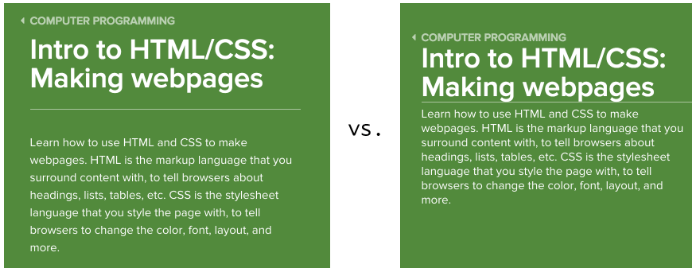
By default, browsers display web pages with the generic ‘serif’ font family, which tends to make the pages more formal. You can decide to change this by putting the generic font family ‘sans-serif’, or you can specify a particular font family, which is found on most computers, like ‘Garamond’ or ‘Helvetica’.
To give your web page a distinct look, you can also use a custom web font. For example, a nice ‘sans-serif’ font:

When you use a web font, you have a file containing the characters in the font downloaded by the user’s browser to the user’s computer so that file can be referenced from CSS. This is an additional download for the browser. So do not add too much, or include without intention to use. A great resource for free web fonts is Google Web Fonts. Take a look at this example page, using two Google web fonts.
Wherever you find your fonts, you need to be careful not to overload. In general, you shouldn’t use more than two or three font families on a page, and your fonts should visually match. Here’s a helpful website that gives examples of Google web fonts that fit well together.
Choose good colors:
When designing a web page, a web developer often wants to use a color palette (a set of colors that work well together and can be used in different parts of your web page). These colors can be determined from your company logo, they can relate to the theme of the page, or they can just look pretty together.
Need help putting together a palette? Web design companies Ireland are available for affordable websites.
If you have already selected a few basic colors, you can take a tour of Palette, a tool that allows you to visualize different types of palettes: monochromatic, triads, with analogous colors, and tetrads.

If you’re starting from scratch, you can browse the palettes of COLOR Lovers, a community of color lovers who share ideas for colors, palettes, and patterns. Here is a palette named Giant Goldfish:

Once your chosen palette comes the tricky part: determining which colors to apply on the different parts of your web page. What color should the titles be? The links? The text? The bottom? A big plus of the Palette site is that it gives examples of web pages using palettes:

As you decide how your palette will be transformed into CSS, consider these few things:
- If you change the style of the links too much from the default ones, the user might no longer recognize the links.
- The colors of the text and the background of the text should contrast enough so that the user does not have to squint. Check your colors in this contrast checker.
- Many people are color blind. Some color combinations will not contrast enough for them. Check your colors in this color simulator as seen by color blind people.
If you’re not sure how to use your color palette, send your work to a few friends also web design course Dublin, for their opinion. Can they read everything? Do they see what is clickable? Do certain colors make them cringe? What colors do they like?
Use space
I once asked a colleague (who is now a designer at Google) the secret to good web design. His answer? Space management!
Space is the spacing between elements, which in CSS terms usually translates to properties like ‘padding’, ‘margin’, and ‘line-height’.
My friend is right: space has a big impact on how a web page looks and how easy it is to read. My designer friends working at web design Ireland, sometimes spend hours fine-tuning the space, precisely because they know how important it is.

How should you take this into account? It is difficult to establish hard and fast rules on the management of space. Just be aware of it. Whenever you have an element next to another element, determine the margin to put between the two. If you have an element with a background, or a border, consider the spacing with the content. When creating paragraphs or lists, think about the line height to use to make them pleasant to read.
Start with templates or frameworks:
You might be intimidated after reading all of these tips, especially if you don’t consider yourself to be strong at conception. Don’t worry, you don’t have to be a design expert to have a stylish web page. In fact, you can start from a template or a framework, to take advantage of the work that other designers have done.
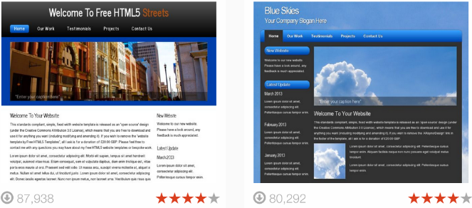
A template is HTML and CSS that almost already looks like a finished web page, often with artificial content. You can find templates on OpenDesigns.org or by using these keywords “free web page templates” in a search engine (and hopefully these are indeed free!). As soon as you’ve uploaded a template, you can replace the content and modify the CSS to suit your needs.

A CSS framework is a set of CSS rules that provide a good starting point for a sophisticated website. There are many popular CSS frameworks that make it easy to build beautiful websites: Twitter Bootstrap, Pure CSS, Topcoat , and more.
Once you’ve downloaded a CSS framework, you can browse the documentation for examples (there are also often templates there!) To determine the class names needed to achieve the look you want.
When using templates or frameworks, you take the risk that your website looks exactly like other websites and therefore does not stand out that much. To avoid this pitfall, add your own logo and change a few key things like the font family or the background color.
Design Mobile Friendly Websites:
Search Engines are now going for mobile 1st technology. According to this aspects, the websites must be mobile friendly for mobile users in order to improve their online visibility. A website can be developed mobile friendly if it’s developed keeping in view the SEO aspects. So, for website development your developer must know what is necessary for designing optimized websites. An SEO company that also offers web development services is the best in designing mobile friendly websites.


