Data Design for Maximum Impact: Create Charts That Connect

Data visualization is “data that one abstracts into a certain graphical form, comprising variables or attributes for the units of information,” says Michael Friendly. Stated differently, effective data design is a logical approach to conveying quantitative information through images. One can use different visual aids, including bar charts, pie charts, and maps, to depict data, depending on its characteristics.
Chart design experts should consider the best method to show data collection and follow data visualization best practices graphically. Visual representations of data must be informative, eye-catching, and never deceptive. Creating visually appealing and functional visualizations requires developing a consistent framework, especially when working with very big data sets.
Picking The Right Type of Charts For The Job
No one format works for all data. So, carefully analyze your options and select the one that will best tell your story. Also, address the important questions the data raises, all while supporting your core goal. Even merging similar chart design options can be useful at times. It can encourage more in-depth research that yields useful business insights and solutions that motivate action.

So, which chart layout options are in demand?
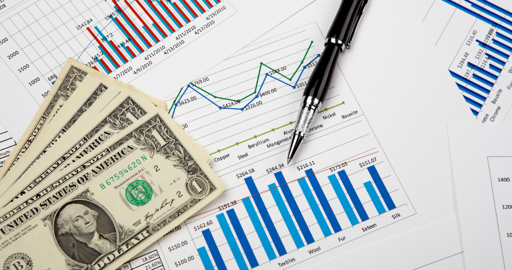
- Bar charts are among the most popular data visualizations because they are useful for comparing categories within a single metric. These work especially well with data that may be divided into several categories.
- Bullet charts were created to replace dashboard gauges, thermometers, and meters by comparing measures to demonstrate progress toward a goal.
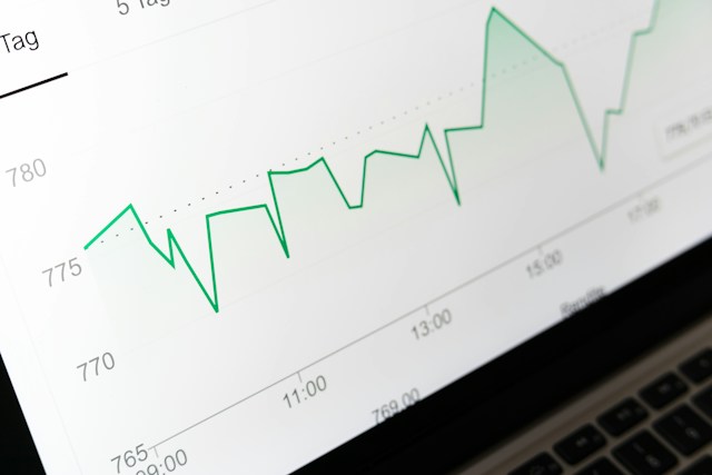
- The line graph presents multiple discrete data points as a single, continuous progression by connecting them. The end result is an easy-to-understand method for visualizing changes in one variable about another.
- Box plots and histograms let you compare categories and display the clustering of your data.
- Using maps to visualize location-specific queries and support geographical exploration makes perfect sense.
- Pie charts work best when accentuating details in other visualizations; they are less useful when used alone.
Predictable Patterns For Effective Data Design
By nature, humans are visual beings. Indicators that provide us with critical information at a glance catch our attention. Humans are pattern-seekers by nature. So, it can be quite challenging to interpret a visualization if the patterns are illogical or arbitrary. Whether your data is presented numerically, alphabetically, or sequentially, ensure it makes sense to visitors to take advantage of these human impulses.
As a basic illustration, align your effective data design with the convention of left-to-right reading if you speak in a language that follows that direction. Make sure the data linkages are evident and the order of the graphs is constant if you’re using more than one. You don’t want viewers to become disoriented as they swiftly and simply go from one point to another.

Craft an All-Inclusive Data Visualization
You can use color to represent and distinguish data in your data storytelling layout anytime, anywhere. According to a recent Salesforce study, it is also a crucial principle that influences user decisions. They did an experiment on how individuals react to various color combinations in charts.
They did so, figuring that since small color variations are more aesthetically pleasing, people would favor palettes with bigger color variations. Subtle color schemes, however visually appealing, proved more challenging to interpret and analyze, according to their findings. That completely negates the intent behind developing a data visualization.
Ending Note
Remember that the software you use to visualize your data must be able to interact with it efficiently and accurately, regardless of the sort of visualization you choose. Whatever data sources you throw at your data visualization software, it should be able to manage them.
You need to be capable of correctly cleaning and preparing your data. An effective data design tool must help you improve your results. You risk building a stunning structure on very fragile foundations if you don’t have a strong, adaptable platform.


